ThoughtBook : Thought & Idea Collection App
ThoughtBook is like a time capsule for your brain—catching fleeting thoughts, shower ideas, & 2 AM revelations before they vanish into the void.
The full story awaits below.
Quick Summary (TL;DR)
ThoughtBook is a journaling app designed to capture fleeting thoughts, ideas, & reflections. The goal was to create a fun, engaging experience that encourages users to jot down their thoughts effortlessly.
Problem Identified: Users struggle to capture fleeting thoughts, leading to lost ideas, scattered notes, & difficulty in organizing personal reflections.
Research & Insights: User interviews & competitor analysis revealed a need for a seamless, engaging, & structured way to jot down & revisit thoughts.
Design Approach: Iterative design focused on a fun, frictionless experience with intuitive UI, mood-based categorization, & effortless note retrieval.
Key Features: Quick thought capture, tag-based organization, smart mood tracking, & a visually engaging journal interface.
Next Steps: Implementing further usability tests, cross-platform expansion, adding dark mode & other feature enhancements.
OVERVIEW
Type of Project
Conceptual
Role
UX Designer
Visual Designer
Tools
Pen & Paper
Figma
Adobe Fresco
Illustrator
Timeline
15 days
"The best way to capture fleeting thoughts is to capture them in words before they disappear." — Unknown
Remember that brilliant idea you had in the shower? Or that deep 2 AM thought that could’ve changed the world—if only you’d written it down? Well, you would, if you had ThoughtBook.
With ThoughtBook, you could capture genius-level insights, random brain dumps, or just make sense of life one thought at a time. This app was designed to help you collect, reflect, & maybe even discover patterns in your beautiful chaos.
All entries can be made in text & you can add media like photos & voice notes to make them even more descriptive in ThoughtBook.

The Backstory
Ironically, ThoughtBook began as a thought I almost lost. Months ago, I had scribbled down an idea for a wearable thought-collecting device in my diary, & then I forgot about it. I was looking for a project idea when I stumbled upon the note again, & it hit me: thoughts & ideas are short-lived, & I could have easily lost it had I not written it down. If that small idea could lead to an entire app, how many great thoughts do we all let slip away daily?
That moment turned into a full-circle realization—what started as just another passing thought became a tool designed to make sure no idea gets left behind. This is how ThoughtBook proved its own necessity to me before it even existed.
OUTLINING THE PROBLEM
Problem Statement
Every day, people have fleeting thoughts—creative ideas, deep reflections, random epiphanies—but most of them are lost before they can be captured. This leads to valuable ideas slipping away, scattered across different apps, sticky notes, or forgotten entirely.
The Goal
To design a product that will allow users to effortlessly capture & organize their thoughts by creating entries on the go. Users would be able to categorize their ideas, reflections, & moods using filters, so that they could revisit them later using the search functionality.
Initial Research
Preliminary research (via Google form) was conducted to understand how people capture & organize their thoughts, identify common pain points, & evaluate existing solutions in the market. The aim was to collect insights about user behaviors & challenges in maintaining a consistent thought collection habit.
Their responses were captured in the form of an affinity map as shown below.

As I sifted through the responses, a pattern emerged— everyone had thoughts, but they treated them differently. Some jotted ideas in scattered apps & never revisited them. Others hesitated to write at all, fearing the cringe of rereading old musings, or worse, having someone else read them. These insights shaped the user personas of real people with real struggles.

User Persona #1

User Persona #2
Competitor Analysis
With an understanding of my users' needs, the next step was to explore existing solutions. There were some questions that needed answering- How are people currently capturing their thoughts? What gaps do popular journaling & note-taking apps leave unaddressed?
I tried using two popular journaling apps- Day One & Apple Journal App. The user experience of these apps helped in shaping the user flows of ThoughtBook. The interfaces have been briefly compared below.

Apple Journal App

Day One App
Why Journaling?
A few of the research participants were unconvinced of the need for collecting thoughts & ideas. There are several books that address this question. The book that I found most relevant for this particular use-case is How to Take Smart Notes by Sönke Ahrens (2017). This book discusses the Zettelkasten method, a knowledge management system based on linking ideas & focuses on how capturing small thoughts can lead to bigger insights over time.
Key Insights
Compiling all the research data, I was able to underline a few actionable insights for ThoughtBook's design-
- Make journaling effortless & low-commitment: Enable quick-entry formats like short notes, voice memos & images
- Make past entries accessible: Introduce categorized tags & a timeline view
- Reframe journaling as valuable: Gamify journaling with insights & mood analytics to make it feel rewarding & habit-forming
- KISS: Keep the interface simple & intuitive, without adding an overload of unnecessary features.
THE DESIGN
Ideation
The first step in the design phase was to do some wireframing to start developing the app's interface.

Paper Wireframes
Playing around with sketches of different screens helped me decide upon which screens would best display the essence of ThoughtBook. Then I proceeded with making digital wireframes for those screens.
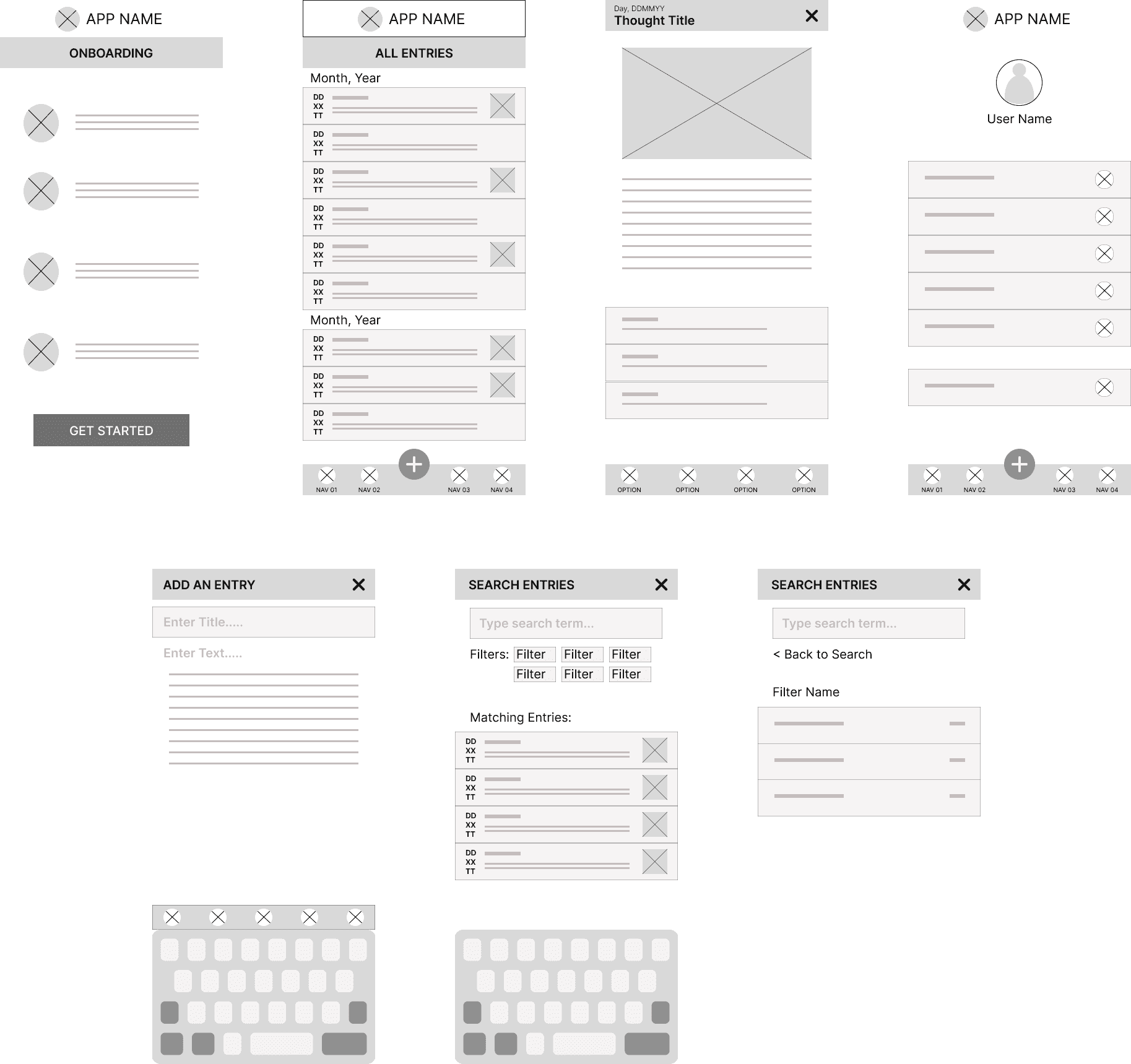
Digital Wireframes
Visual Framework
With the core structure in place through digital wireframes, it was time to bring ThoughtBook to life visually. Since journaling can often feel like a chore, the goal was to design an interface that feels engaging, joyful, & effortless- rather than another task on the to-do list. Through playful colors & a welcoming aesthetic, the visual design focused on making the app an enjoyable daily ritual.
The Typography was carefully chosen to make the app approachable while also giving a sense of creativity. I believed that a combination of a serif & sans serif typefaces could give a feeling of whimsy & lightness, which was reinforced in the subsequent usability test.

Design System
High-Fidelity Design
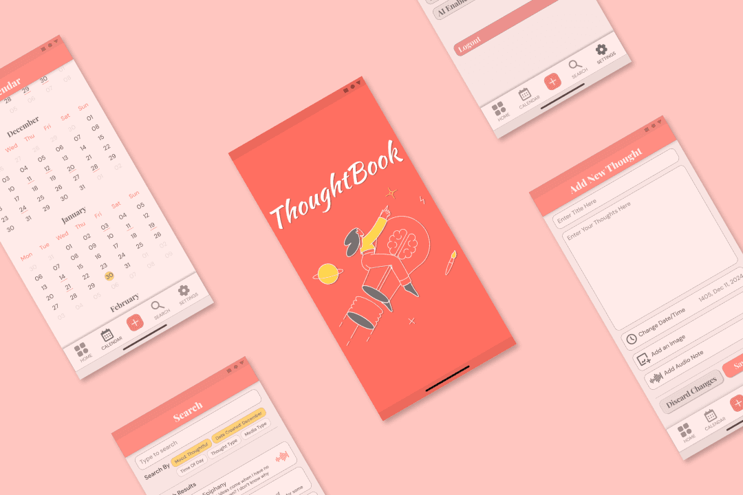
The wait was over! The final look of ThoughtBook finally materialized after all the research & ideation.

Hi-Fi Mockups
The Prototype
Shown below is an interactive prototype of the app made using Figma. You can either use the arrow keys to skip through screens or click on specific areas of any screen which performs the assigned function. Have fun!
TESTING & ITERATION
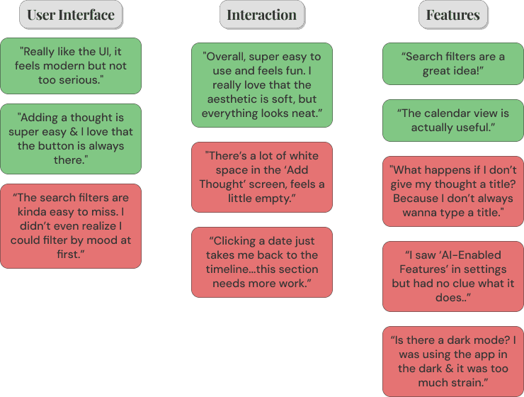
To ensure the experience met user expectations, usability testing was conducted on the first version of the prototype to identify friction points & validate design decisions.
User Feedback
For the usability testing, I reached out to the same people who had participated in the Google form survey during the initial research stage. Their feedback has been collated in the diagram below.
Design Optimization
After getting this feedback, I was sure that I was on the right track with the visuals, but there were some crucial changes to be made. So I made some adjustments to the design.
01.

02.

From improving search filter functionality to optimizing the thought entry experience, each update was driven by real user feedback. With these refinements in place, the app was now more aligned with its core vision: making thought collection an enjoyable ritual.
CONCLUSION
Next Steps
Following are some potential future plans for ThoughtBook, based on the data collected so far-
Further Testing: Run a second round of usability testing to validate recent improvements.
Market Expansion: Develop a cross-platform version including desktops & tablets.
Dark- Mode: Users could have the option to toggle between Dark & Light modes to enhance accessibility.
Additional Features: Mapping out the AI features of the app & using them to add insights, & give prompts to the users to help them articulate their thoughts.
Learnings
Other than the important of valuing your ideas, working on ThoughtBook taught me the importance of balancing functionality with emotion. ThoughtBook is not just about usability, it is about how users feel when using it. If the user feels positive while using a product, the entire experience is elevated automatically.
I also learned that in any user facing product, simplicity enables adoption, & engagement retains that connection.
Next Project
ThoughtBook : Thought & Idea Collection App
ThoughtBook is like a time capsule for your brain—catching fleeting thoughts, shower ideas, & 2 AM revelations before they vanish into the void.
The full story awaits below.
Quick Summary (TL;DR)
ThoughtBook is a journaling app designed to capture fleeting thoughts, ideas, & reflections. The goal was to create a fun, engaging experience that encourages users to jot down their thoughts effortlessly.
Problem Identified: Users struggle to capture fleeting thoughts, leading to lost ideas, scattered notes, & difficulty in organizing personal reflections.
Research & Insights: User interviews & competitor analysis revealed a need for a seamless, engaging, & structured way to jot down & revisit thoughts.
Design Approach: Iterative design focused on a fun, frictionless experience with intuitive UI, mood-based categorization, & effortless note retrieval.
Key Features: Quick thought capture, tag-based organization, smart mood tracking, & a visually engaging journal interface.
Next Steps: Implementing further usability tests, cross-platform expansion, adding dark mode & other feature enhancements.
OVERVIEW
Type of Project
Conceptual
Role
UX Designer
Visual Designer
Tools
Pen & Paper
Figma
Adobe Fresco
Illustrator
Timeline
15 days
"The best way to capture fleeting thoughts is to capture them in words before they disappear." — Unknown
Remember that brilliant idea you had in the shower? Or that deep 2 AM thought that could’ve changed the world—if only you’d written it down? Well, you would, if you had ThoughtBook.
With ThoughtBook, you could capture genius-level insights, random brain dumps, or just make sense of life one thought at a time. This app was designed to help you collect, reflect, & maybe even discover patterns in your beautiful chaos.
All entries can be made in text & you can add media like photos & voice notes to make them even more descriptive in ThoughtBook.
The Backstory
Ironically, ThoughtBook began as a thought I almost lost. Months ago, I had scribbled down an idea for a wearable thought-collecting device in my diary, & then I forgot about it. I was looking for a project idea when I stumbled upon the note again, & it hit me: thoughts & ideas are short-lived, & I could have easily lost it had I not written it down. If that small idea could lead to an entire app, how many great thoughts do we all let slip away daily?
That moment turned into a full-circle realization—what started as just another passing thought became a tool designed to make sure no idea gets left behind. This is how ThoughtBook proved its own necessity to me before it even existed.
OUTLINING THE PROBLEM
Problem Statement
Every day, people have fleeting thoughts—creative ideas, deep reflections, random epiphanies—but most of them are lost before they can be captured. This leads to valuable ideas slipping away, scattered across different apps, sticky notes, or forgotten entirely.
The Goal
To design a product that will allow users to effortlessly capture & organize their thoughts by creating entries on the go. Users would be able to categorize their ideas, reflections, & moods using filters, so that they could revisit them later using the search functionality.
Initial Research
Preliminary research (via Google form) was conducted to understand how people capture & organize their thoughts, identify common pain points, & evaluate existing solutions in the market. The aim was to collect insights about user behaviors & challenges in maintaining a consistent thought collection habit.
Their responses were captured in the form of an affinity map as shown below.
As I sifted through the responses, a pattern emerged— everyone had thoughts, but they treated them differently. Some jotted ideas in scattered apps & never revisited them. Others hesitated to write at all, fearing the cringe of rereading old musings, or worse, having someone else read them. These insights shaped the user personas of real people with real struggles.
User Persona #1
User Persona #2
Competitor Analysis
With an understanding of my users' needs, the next step was to explore existing solutions. There were some questions that needed answering- How are people currently capturing their thoughts? What gaps do popular journaling & note-taking apps leave unaddressed?
I tried using two popular journaling apps- Day One & Apple Journal App. The user experience of these apps helped in shaping the user flows of ThoughtBook. The interfaces have been briefly compared below.
Apple Journal App
Day One App
Why Journaling?
A few of the research participants were unconvinced of the need for collecting thoughts & ideas. There are several books that address this question. The book that I found most relevant for this particular use-case is How to Take Smart Notes by Sönke Ahrens (2017). This book discusses the Zettelkasten method, a knowledge management system based on linking ideas & focuses on how capturing small thoughts can lead to bigger insights over time.
Key Insights
Compiling all the research data, I was able to underline a few actionable insights for ThoughtBook's design-
- Make journaling effortless & low-commitment: Enable quick-entry formats like short notes, voice memos & images
- Make past entries accessible: Introduce categorized tags & a timeline view
- Reframe journaling as valuable: Gamify journaling with insights & mood analytics to make it feel rewarding & habit-forming
- KISS: Keep the interface simple & intuitive, without adding an overload of unnecessary features.
THE DESIGN
Ideation
The first step in the design phase was to do some wireframing to start developing the app's interface.
Paper Wireframes
Playing around with sketches of different screens helped me decide upon which screens would best display the essence of ThoughtBook. Then I proceeded with making digital wireframes for those screens.
Digital Wireframes
Visual Framework
With the core structure in place through digital wireframes, it was time to bring ThoughtBook to life visually. Since journaling can often feel like a chore, the goal was to design an interface that feels engaging, joyful, & effortless- rather than another task on the to-do list. Through playful colors & a welcoming aesthetic, the visual design focused on making the app an enjoyable daily ritual.
The Typography was carefully chosen to make the app approachable while also giving a sense of creativity. I believed that a combination of a serif & sans serif typefaces could give a feeling of whimsy & lightness, which was reinforced in the subsequent usability test.
Design System
High-Fidelity Design
The wait was over! The final look of ThoughtBook finally materialized after all the research & ideation.
Hi-Fi Mockups
The Prototype
Shown below is an interactive prototype of the app made using Figma. You can either use the arrow keys to skip through screens or click on specific areas of any screen which performs the assigned function. Have fun!
TESTING & ITERATION
To ensure the experience met user expectations, usability testing was conducted on the first version of the prototype to identify friction points & validate design decisions.
User Feedback
For the usability testing, I reached out to the same people who had participated in the Google form survey during the initial research stage. Their feedback has been collated in the diagram below.
Design Optimization
After getting this feedback, I was sure that I was on the right track with the visuals, but there were some crucial changes to be made. So I made some adjustments to the design.
01.
02.
From improving search filter functionality to optimizing the thought entry experience, each update was driven by real user feedback. With these refinements in place, the app was now more aligned with its core vision: making thought collection an enjoyable ritual.
CONCLUSION
Next Steps
Following are some potential future plans for ThoughtBook, based on the data collected so far-
Further Testing: Run a second round of usability testing to validate recent improvements.
Market Expansion: Develop a cross-platform version including desktops & tablets.
Dark- Mode: Users could have the option to toggle between Dark & Light modes to enhance accessibility.
Additional Features: Mapping out the AI features of the app & using them to add insights, & give prompts to the users to help them articulate their thoughts.
Learnings
Other than the important of valuing your ideas, working on ThoughtBook taught me the importance of balancing functionality with emotion. ThoughtBook is not just about usability, it is about how users feel when using it. If the user feels positive while using a product, the entire experience is elevated automatically.
I also learned that in any user facing product, simplicity enables adoption, & engagement retains that connection.